Latest News
“This is jazz history!” they said, “You can keep this inoration alive for almost free, so why not?” they said. |
History

JazzUSA was conceived the night that Art Porter died in Thailand. I was in Chicago visiting with my friend Mark Ruffin when he got a call from one of Art’s people telling him that Art was gone. Mark wrote it up and scooped everyone in Chicago, Art Porter’s home town.
Mark published the article through one of the major Chicago media outlets, and I had the thought that there should be somewhere that jazz lovers could go to get news like this. At the time, the main vehicle for that type of information was the (now defunct) Jazz Central Station, but I felt there needed to be some sort of ‘free press’.
At that time I was in the business of web hosting and design, so developing and hosting it would only cost me time. I talked to Mark about it and he warned me that there was ‘no money in jazz!’ so I did it anyway… I just did it with no expectations of making money. He allowed me to use the Art Porter piece he had written as the very first story on JazzUSA, and the rest is history. Click to Read This Article
– S.H. Watkins, Sr.
Thank You
 THANK YOU to all of the readers that kept coming back and remembered to tell their friends about JazzUSA and who signed up for the giveaways and contests and submitted user reviews! Keep supporting Jazz on the Internet.
THANK YOU to all of the writers that worked for little or nothing to help keep the jazz alive all those years, and the media outlets that were willing to share materials in exchange for credit and links:
|
|
THANK YOU to all of the artists and publicists who kept providing us with the material and media and interview time to keep the content fresh and relevant and often cutting edge for over 21 years.
Top Article
 The Terry Callier interview we posted years ago has been accessed 157 more times than any other article posted during our 21+ years on line. When JazzUSA went dark we were overwhelmed by the number of requests we got inquiring when the article would again be available.
In fact, the overwhelming response that was received seeking this information to be available is one of the reasons we agreed to revive the JazzUSA.com site and set it up as an as an archive.
Top Album
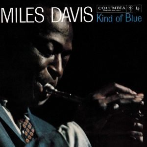 Kind of Blue has been regarded by many as the greatest jazz record, Davis’s masterpiece, and one of the best albums of all time. The influence ‘Kind of Blue’ had on music, including jazz, rock, and classical genres, has led writers to also deem it one of the most influential albums ever recorded.
The album was one of fifty recordings chosen in 2002 by the Library of Congress to be added to the National Recording Registry, and in 2003 it was ranked number 12 on Rolling Stone magazine’s list of the 500 greatest albums of all time. Wikipedia
 08/18/2020 – Congratulations! to former JazzUSA contributor Mark Ruffin on the release of his first novel, Bebop Fairy Tales. Mark was the Original contributor! That’s right, JazzUSA.Com was launched on that first, fateful, article that Mark wrote about the tragic drowning of Art Porter in December of 1996.
- We are actively marketing the domain name JazzUSA.Com.
- Until the domain is sold, the JazzUSA search engine will remain online but there will be no updates to the site.
  |
|
|